Spec Work
OUR FAVORITE, OFF THE CLOCK, OFF THE WALL CREATIONS—INCLUDING FEATURED BRANDS FROM OUR HIT SHOW, CAN THEY BRAND THAT?®
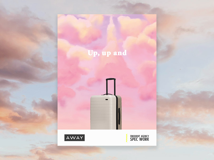
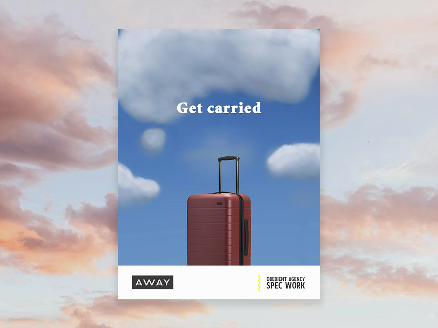
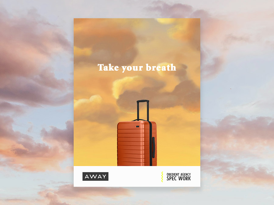
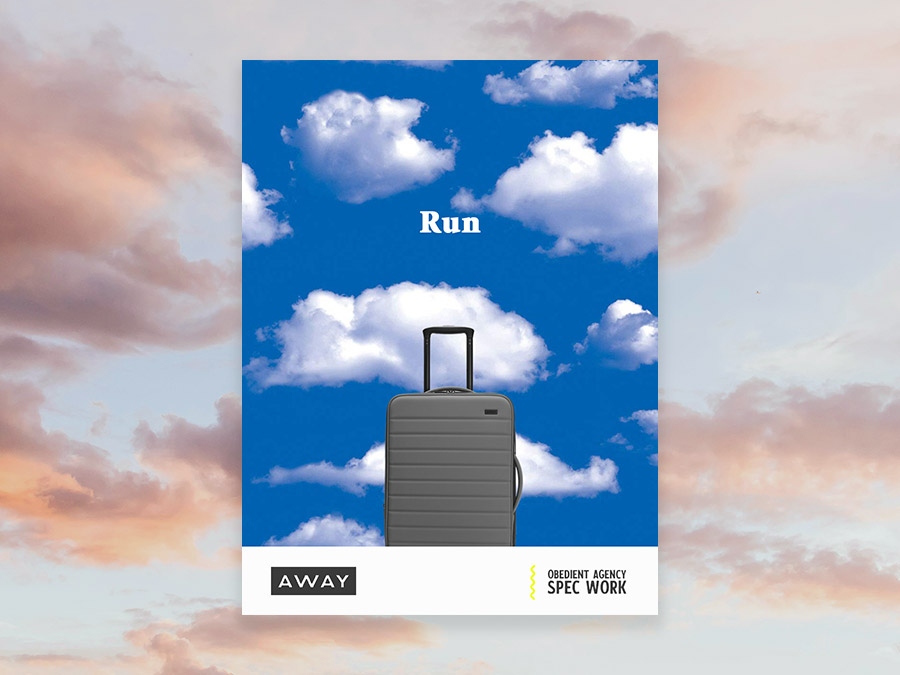
Away
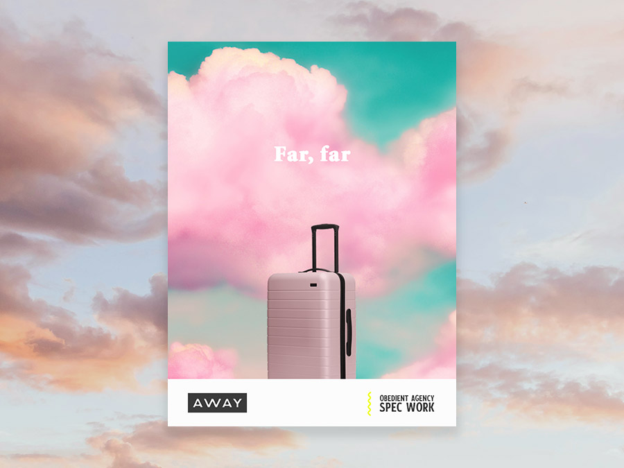
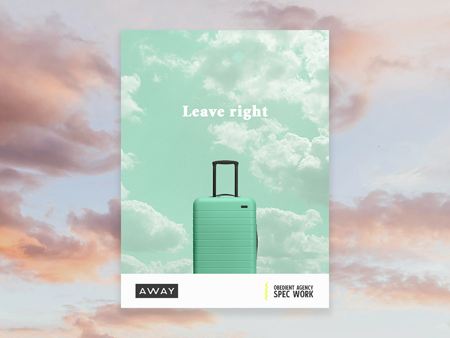
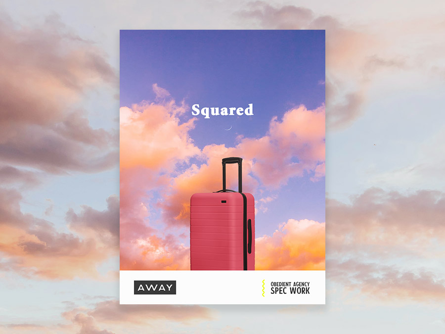
Pack your bags because this spec work takes you up, up and (wait for it…here it comes…the perfect segue to the featured brand) Away. We love how simple and clever this campaign is, and how it so clearly casts Away luggage as the ideal travel mate. Pun Voyage!
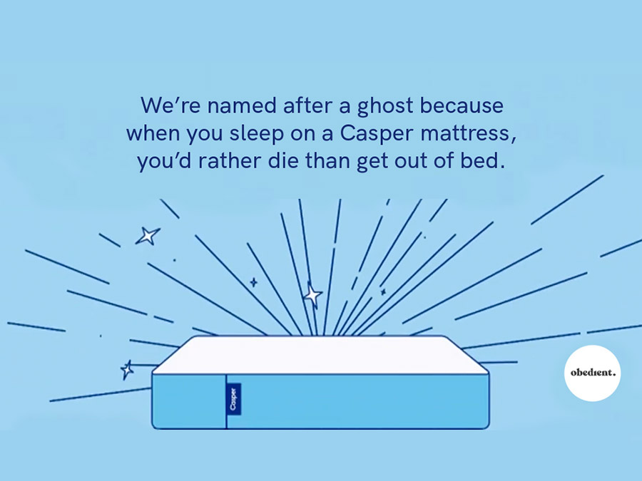
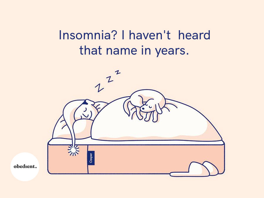
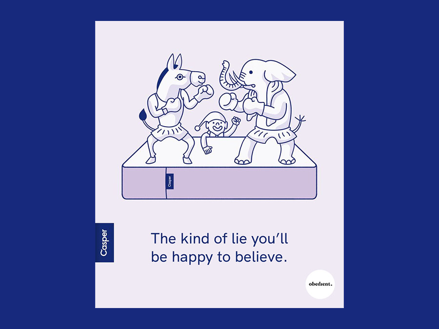
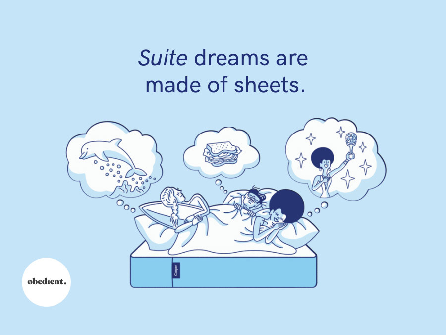
Casper
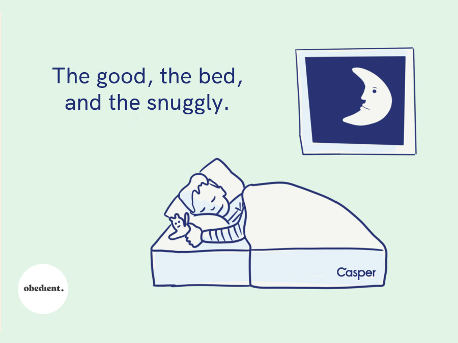
Wake up sleepyheads: the spec project for Casper is the opposite of a snoozefest. Born from a 10 minute Can They Brand That, the resulting work is fit for a slumber party and would help Casper put all of their DTC mattress competitors to bed.
Dropps
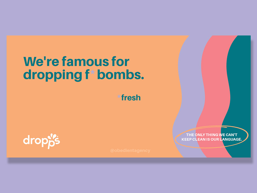
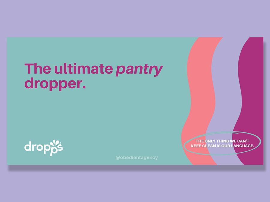
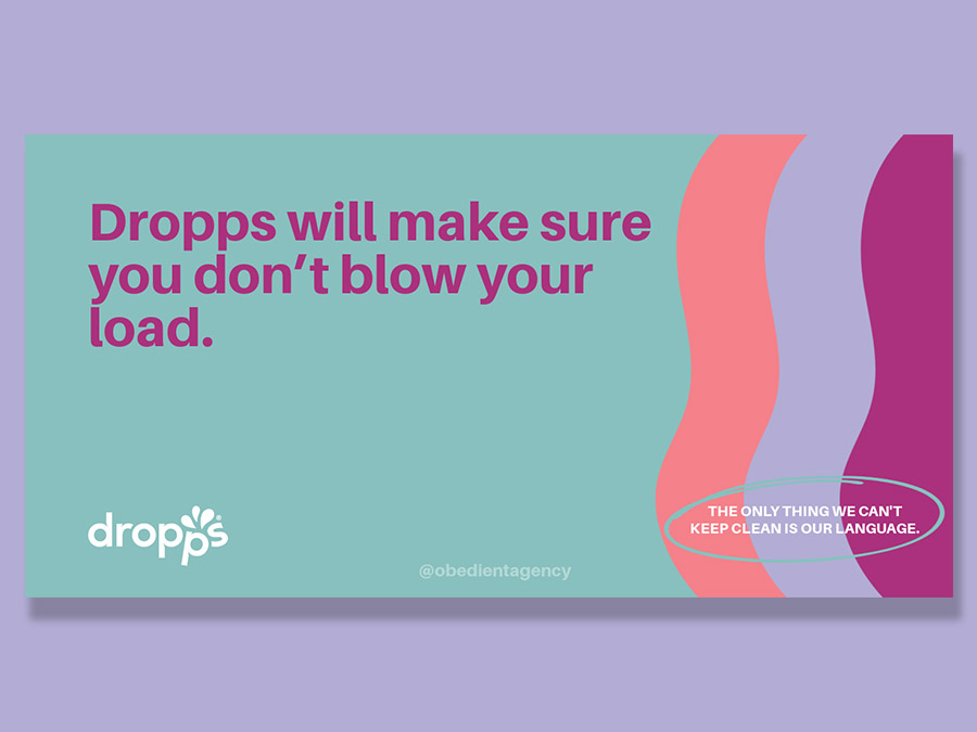
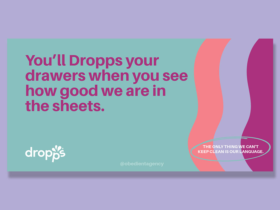
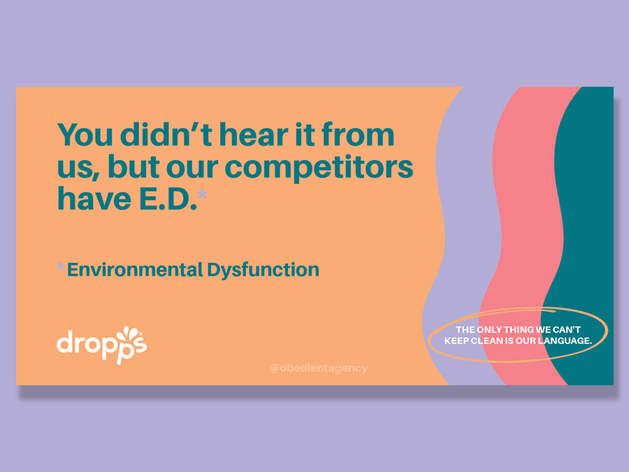
Dropps everything because we really downloaded our best ideas for this cleaning brand (they were the first to do detergent pods!) We love how surprising and bold the resulting campaign is, and as always, are very proud of what we can do in a 20 minute brainstorm.
Smile Direct Club
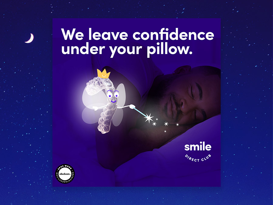
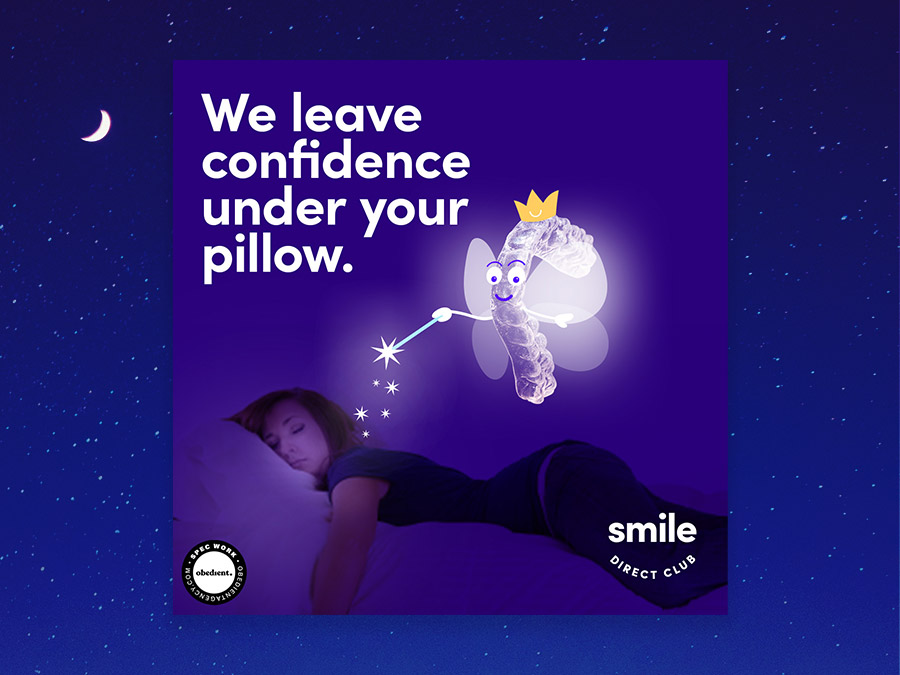
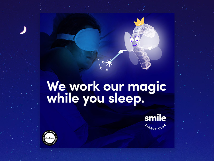
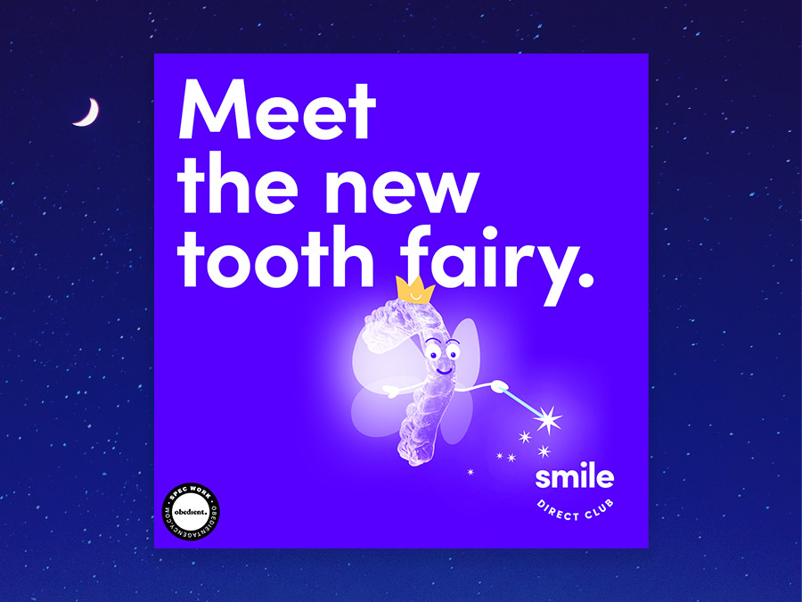
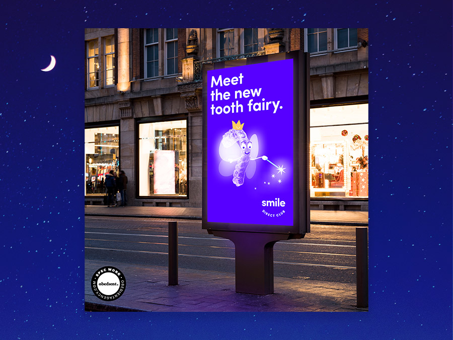
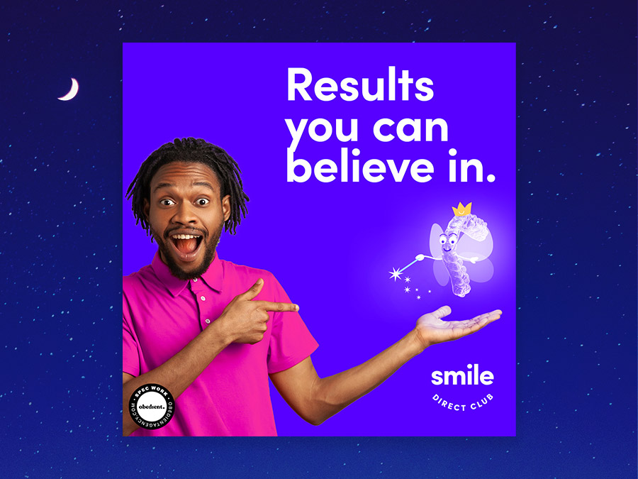
Brace yourself for a fun mouthful of a spec project. As two former metal mouths, it was deeply therapeutic for us to brainstorm creative concepts for Smile Direct Club and the 20 allotted minutes went by faster than you can say, “Cut your corn off the cob.”
Classic Literature As Ads
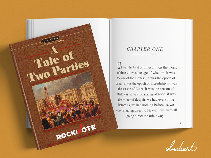
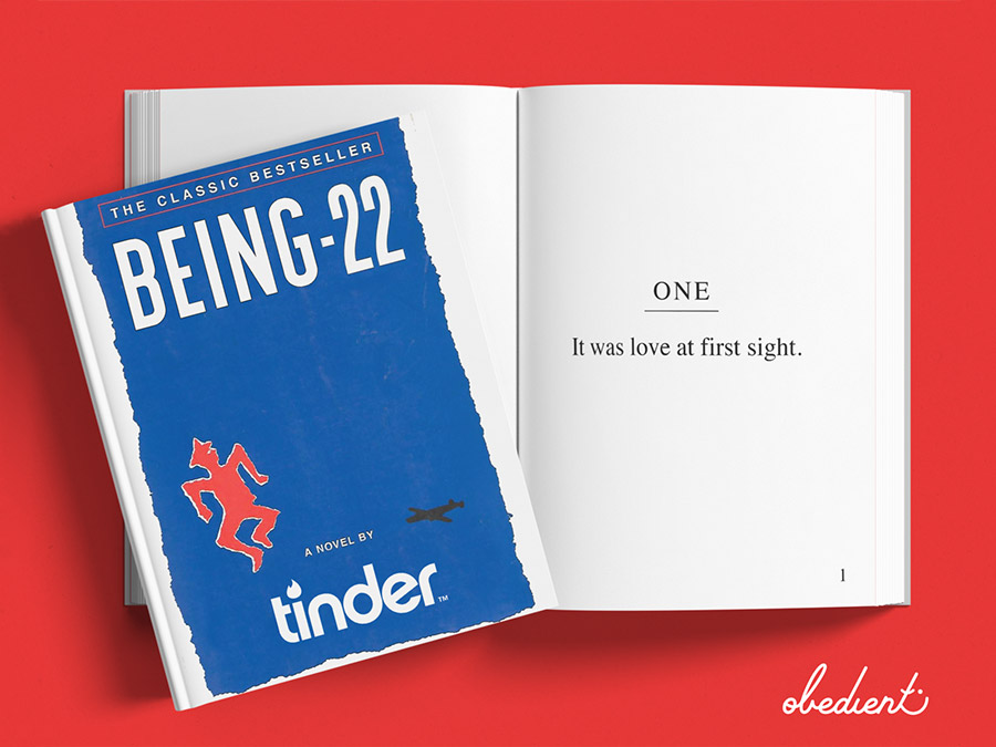
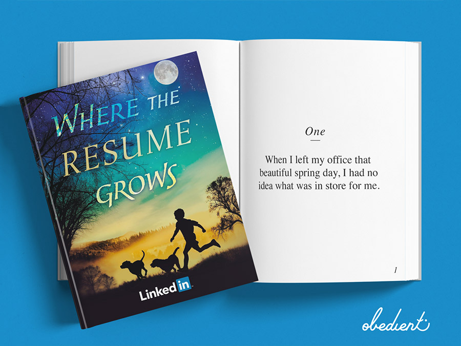
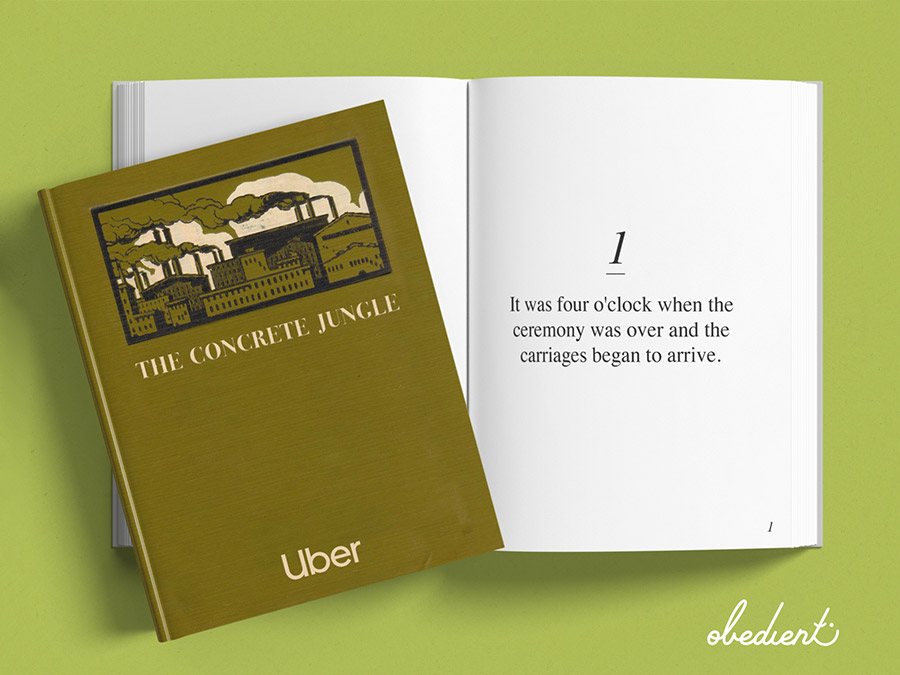
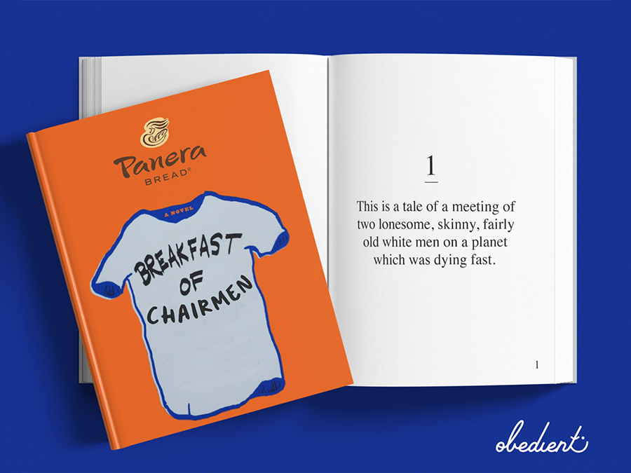
For this page-turner of a creative experiment, we treated unedited, opening lines from famous books as ad body copy, then did some wordplay magic on their titles to use as headline copy. Finally we paired the ‘ads’ with a brand that would benefit from the ethos of this crazy combo.
Zillow
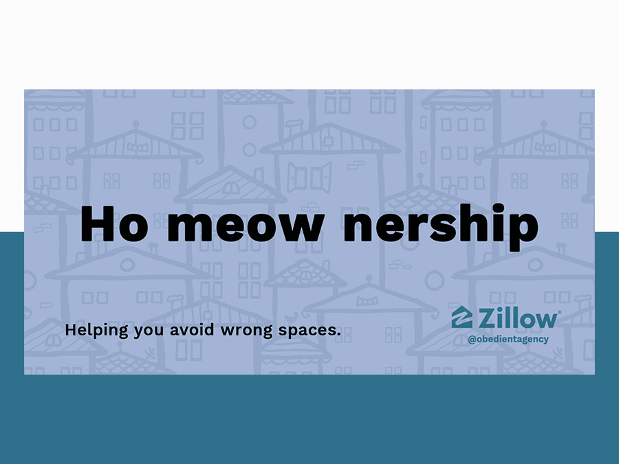
This creative party was based purely off playing around with the double meaning of the word space; bringing the consumer’s attention to how “space” changes everything—both the industry-specific word in the ad PLUS the space you build your life in (read: your home).
Impure Michigan
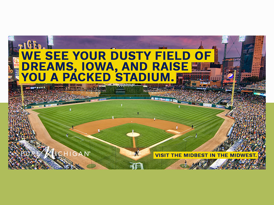
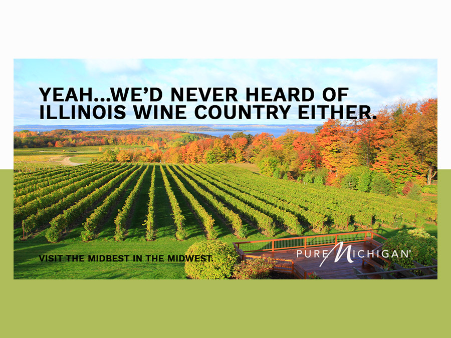
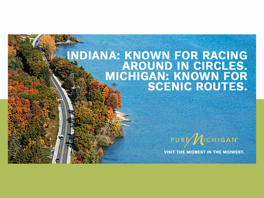
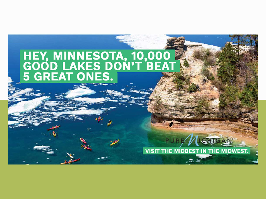
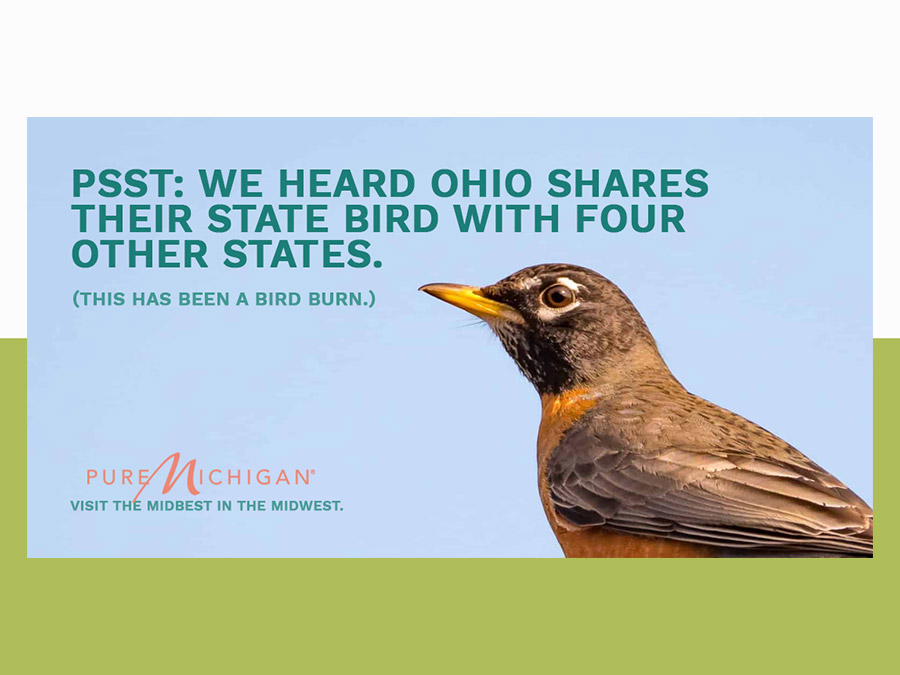
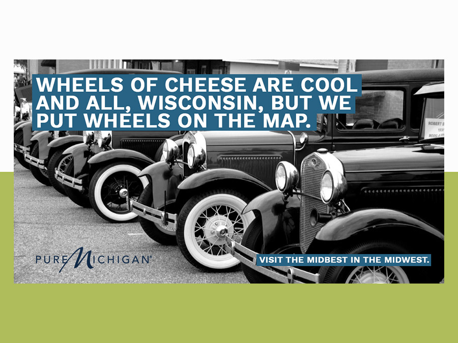
Here in the midwest, “Pure Michigan” tourism ads are iconic—so of course we had to turn it on its head and portray Michigan deviously, but playfully, ripping on nearby states. By contrasting Michigan’s biggest draws with the ‘inadequacies’ of her neighbors, the “Impure Michigan” campaign portrays MI as the unravalted travel destination in its region.
Nog
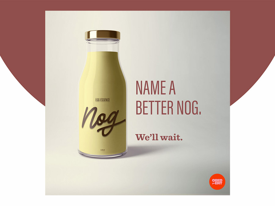
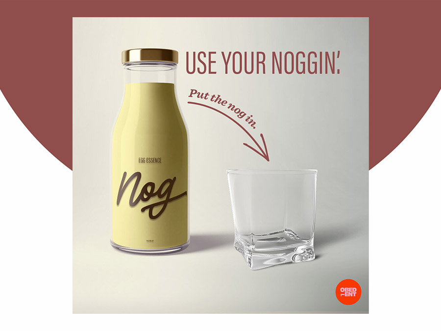
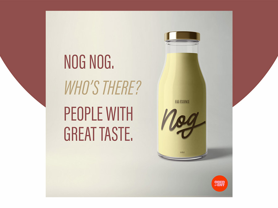
No one asked for it, but we rebranded Eggnog. We reimagined this ~egg essence~ to be sexier and sleeker than ever before, with a new name and new packaging. Let’s go nog wild, shall we? No? Cool.
Essential Oils
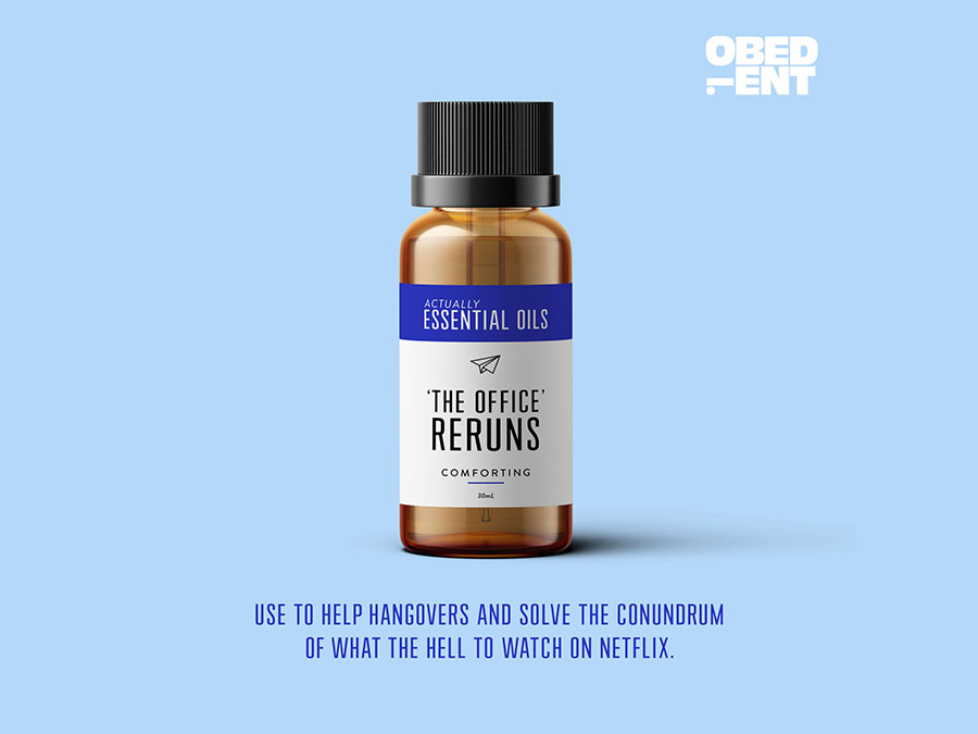
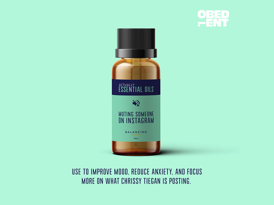
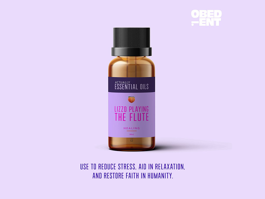
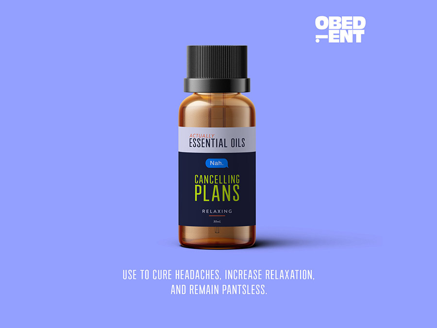
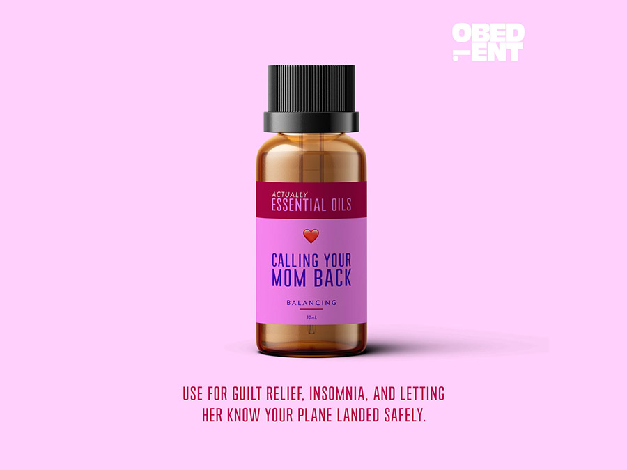
We cranked on a diffuser and gothyperbolic (our favorite) on dreaming up a line of essential oils that bottled-up intangible things that cure modern ailments. Because yes, peppermint oil is energizing but y’know what’s even more energizing? Two drops of a Text Back From a Crush.
Next Door
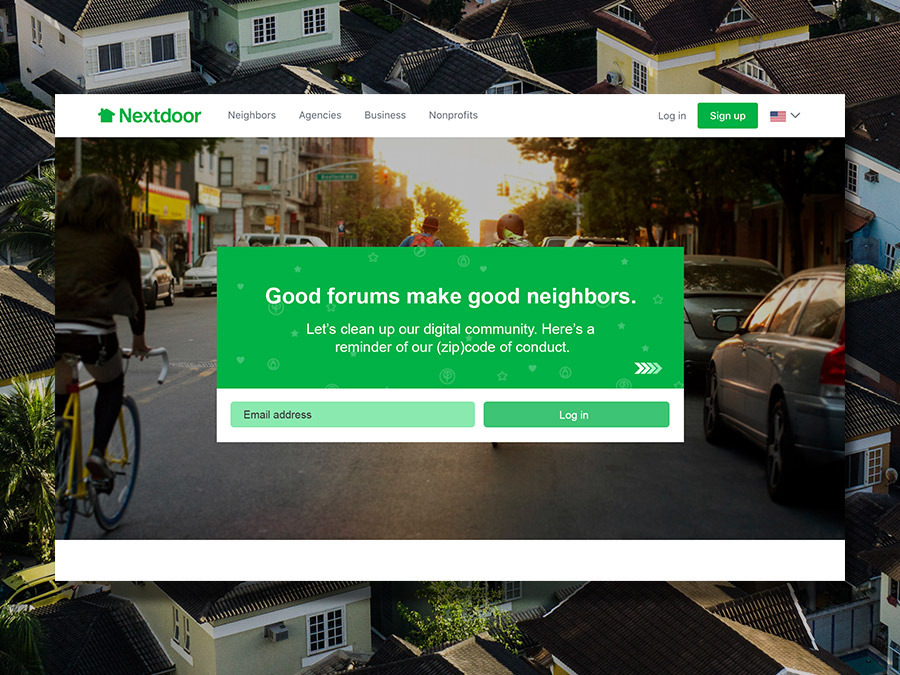
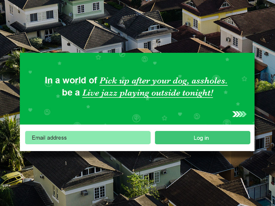
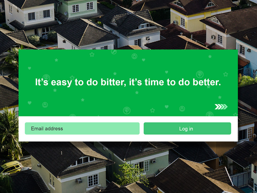
Our “Good Forums Make Good Neighbors,” campaign sought to undo the app’s bad reputation and instill a (Zip)code of Conduct that used wry humor to remind Nextdoor users to maintain the integrity of the app’s intended purpose: to be a helpful, communal experience.
Planet Fitness
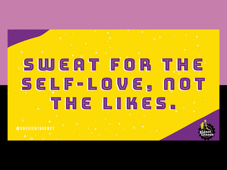
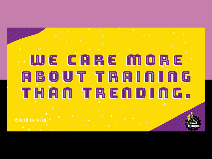
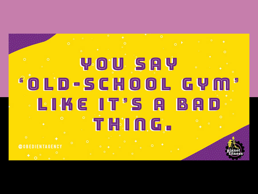
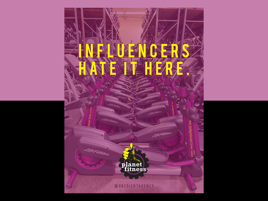
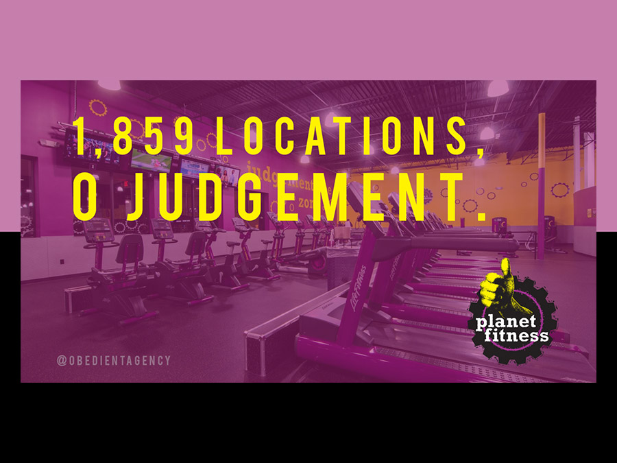
In the land of soul cycling, pure parring, and orange theory-ing, how can a regular ‘ol gym even compete? By winning at your own game. With that strategy in mind, we embraced the ‘old school gym’ feel and offerings of Planet Fitness to appeal to people fatigued by boutique, over-hyped, pricey, image-obsessed gyms.
Minor Figures
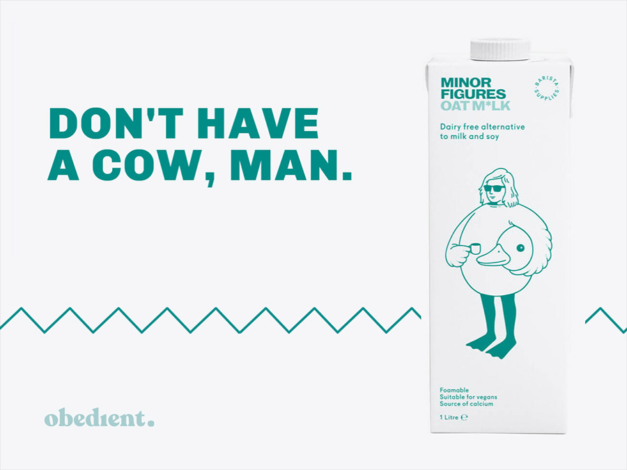
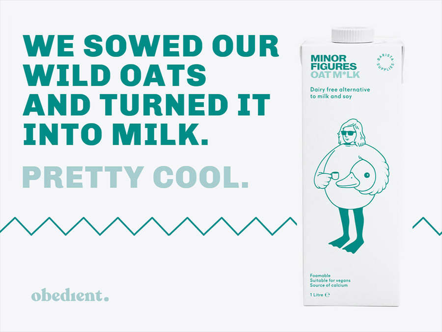
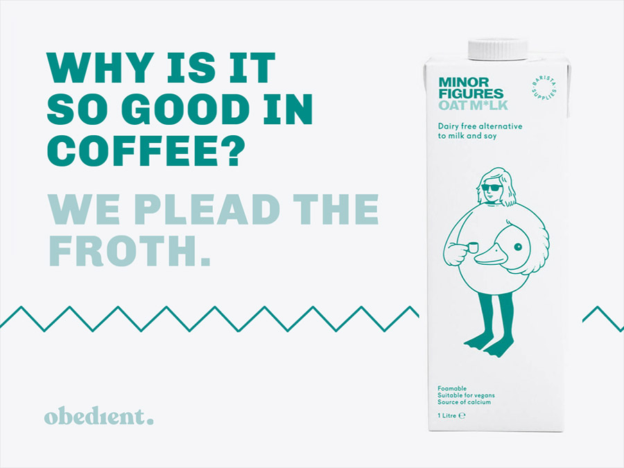
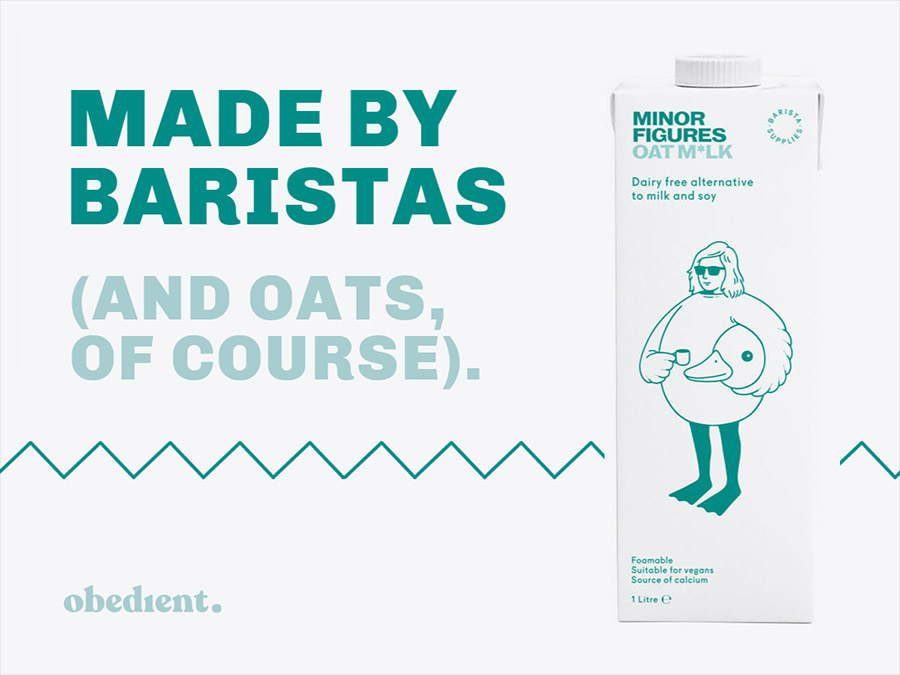
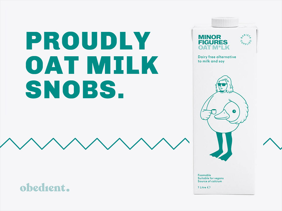
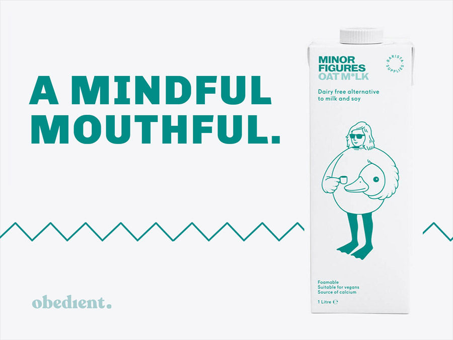
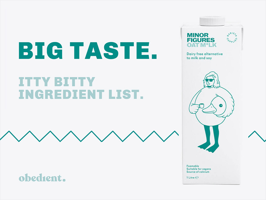
This spec project is simple (and delicious): The oat milk market is oat-rageously saturated, so we gave ourselves an hour to ideat a bunch of stand-oat slogans for a brand of oat milk we oat-dore (ok that one was a stretch), Minor Figures.
Wendys
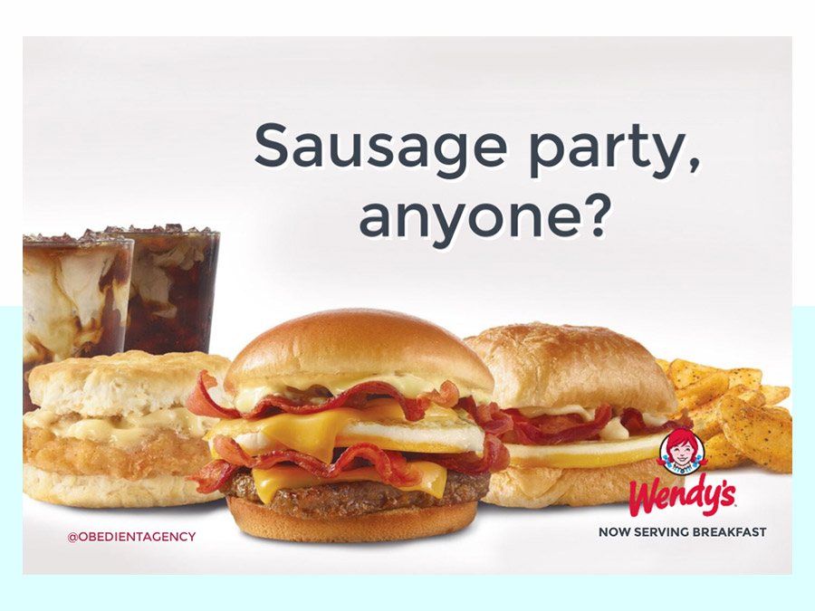
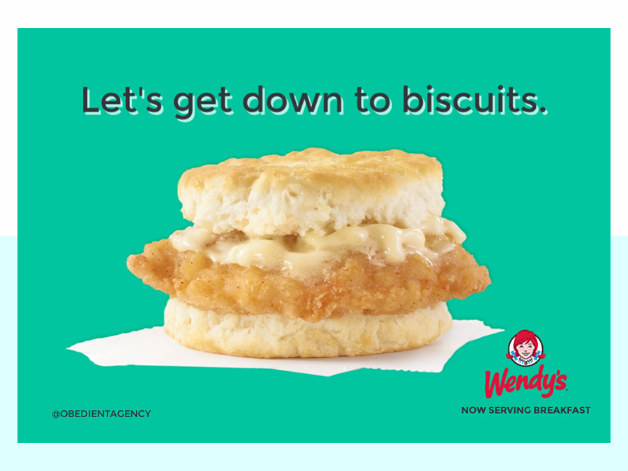
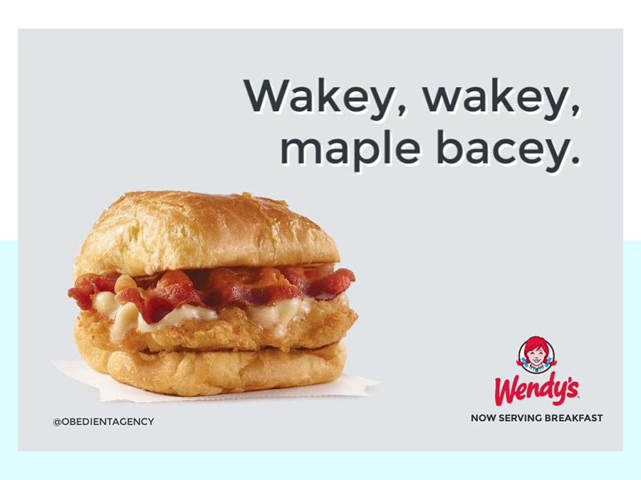
We let our imaginations go off and think of the silliest, wittiest ways to announce and introduce Wendy’s new breakfast menu. We hope this inspires everyone to exclusively call bacon ‘bacey’ henceforth.
7-Eleven
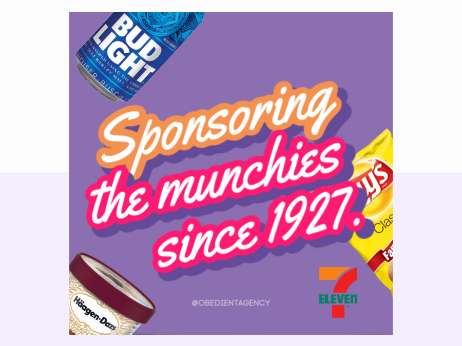
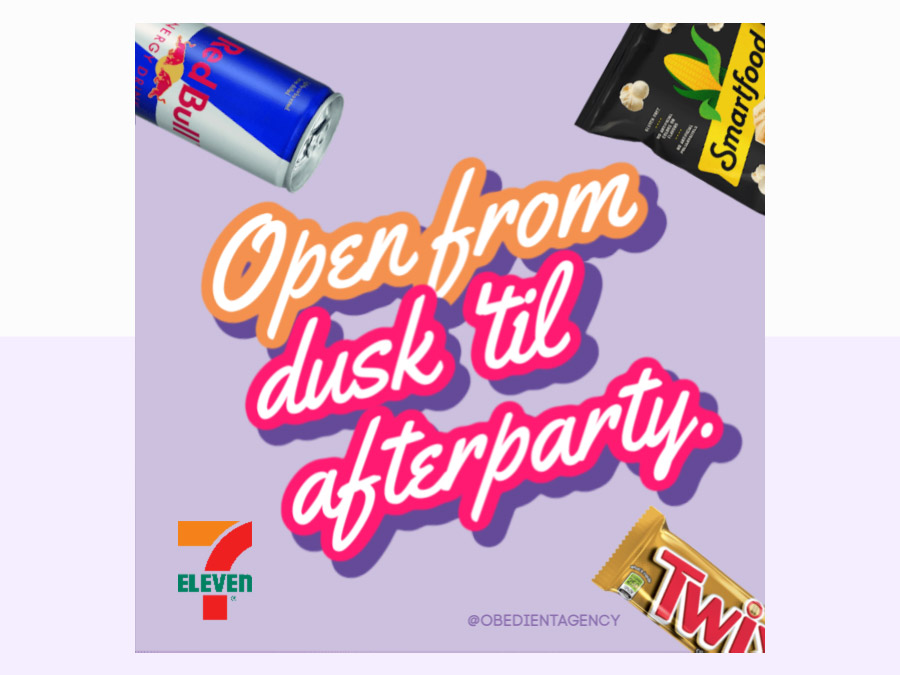
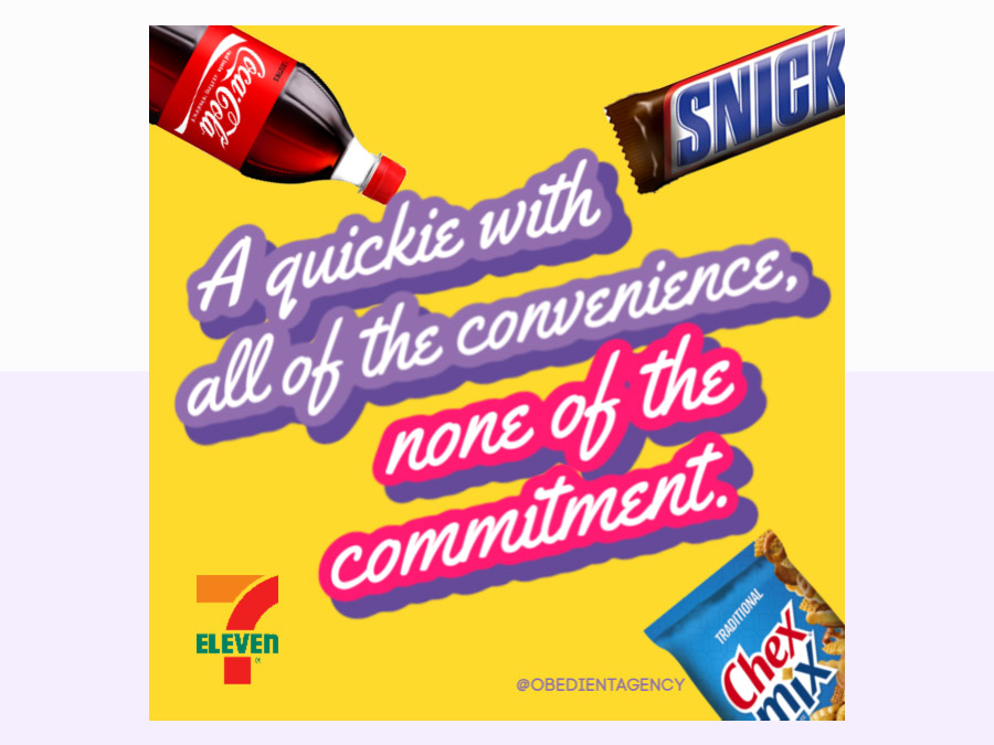
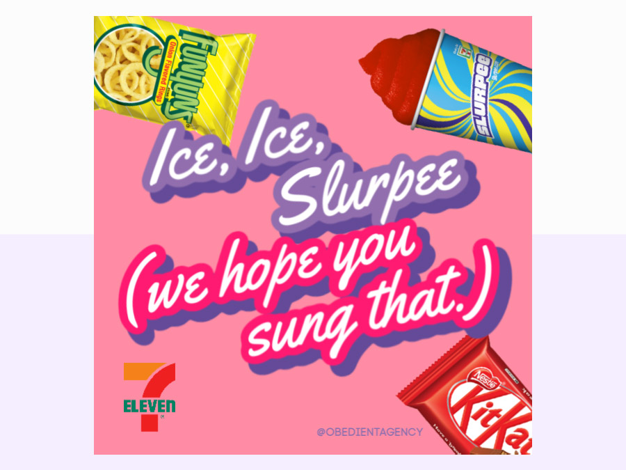
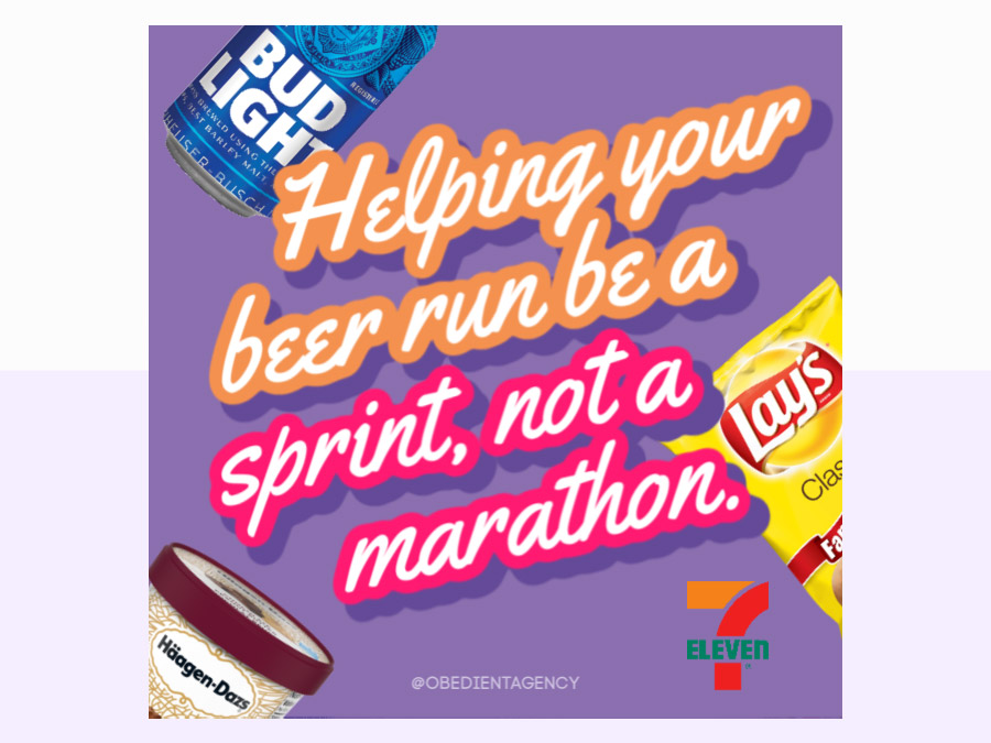
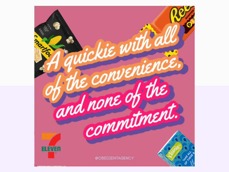
This spec project was fueled by beef jerky the challenge of highlighting 7-eleven as the better choice over its competitors: other convenience stores, drug stores, and gas stations. Bonus: these fun lines of copy pair remarkably well with a Slurpee, just saying.
Thanksgiving
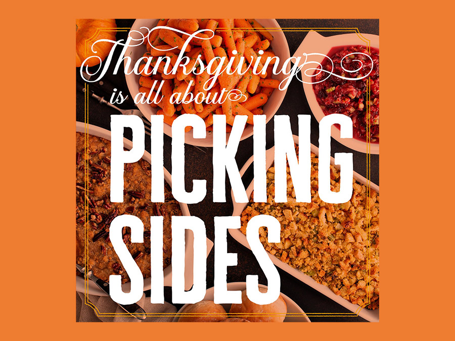
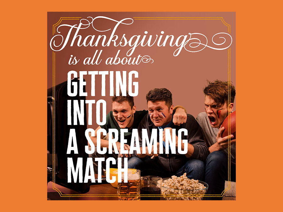
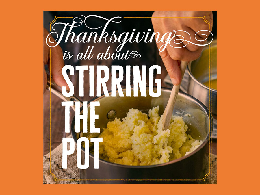
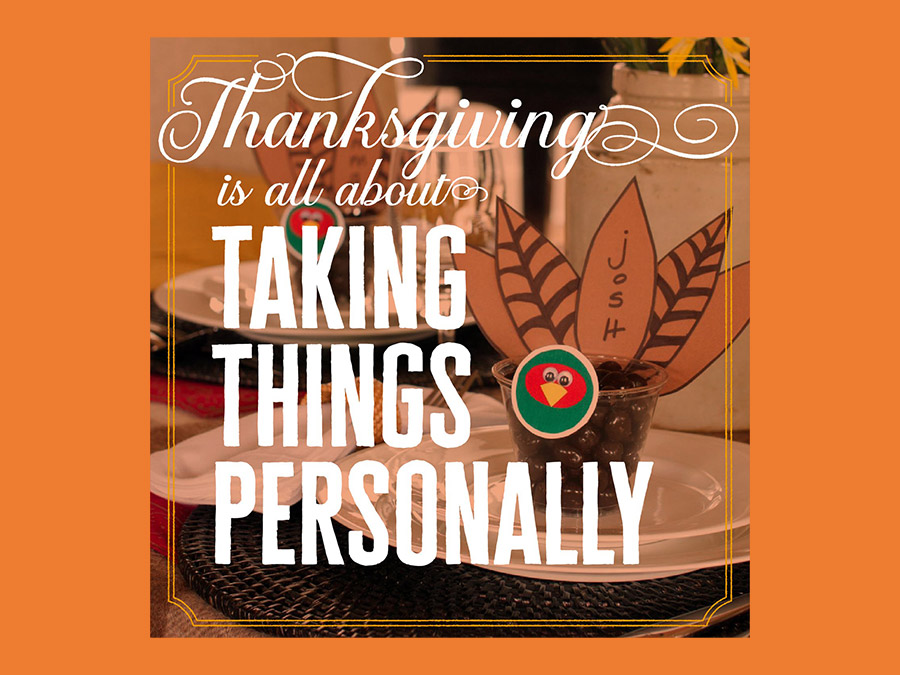
With an attitude of gratitude, we dedicated an entire spec project to brand the Thanksgiving holiday itself. From slogans for specific dishes, to broader concepts on what the holiday represents, you could say we were on a casse-roll coming up with a cornucopia of great ideas.
French Dressing
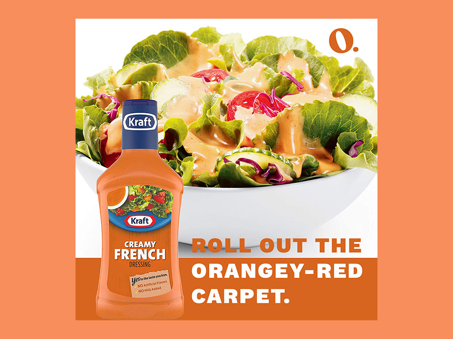
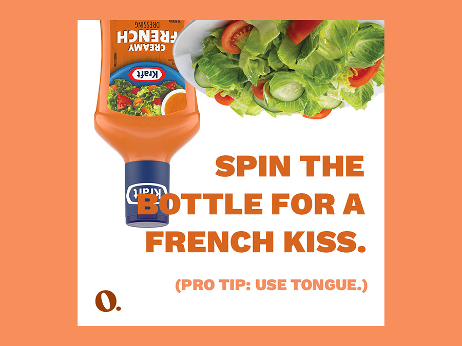
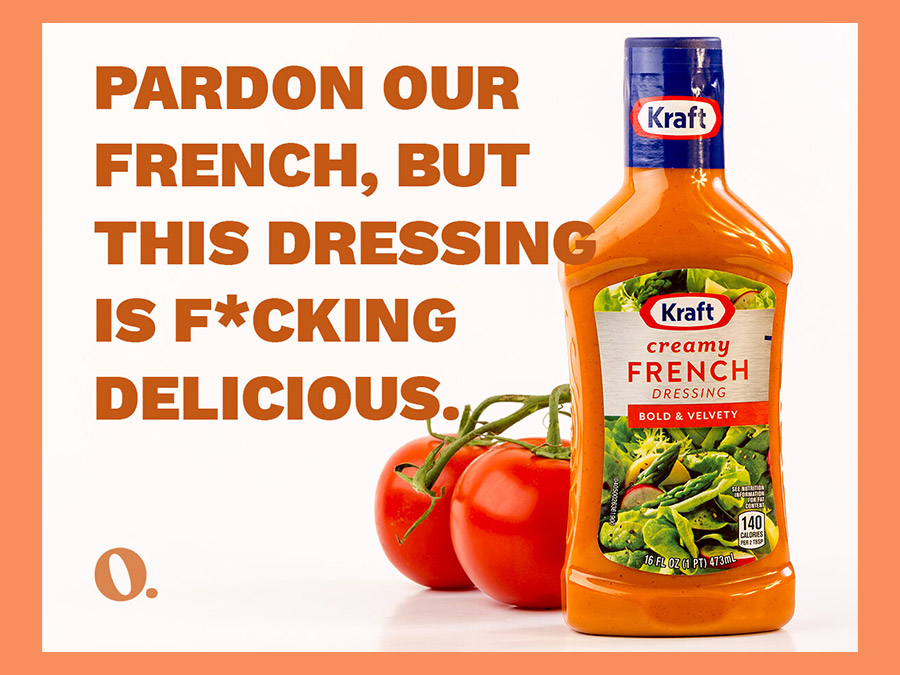
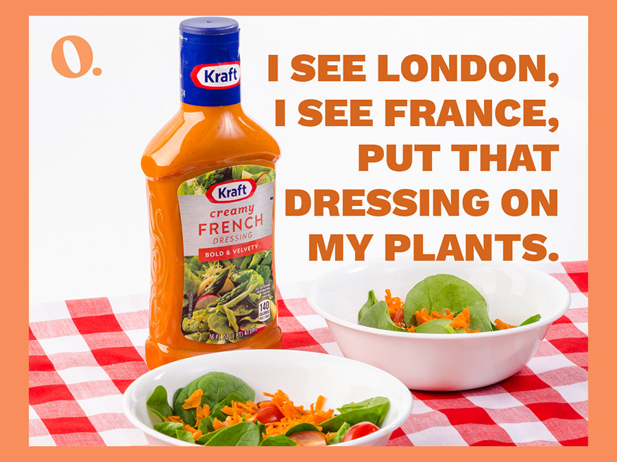
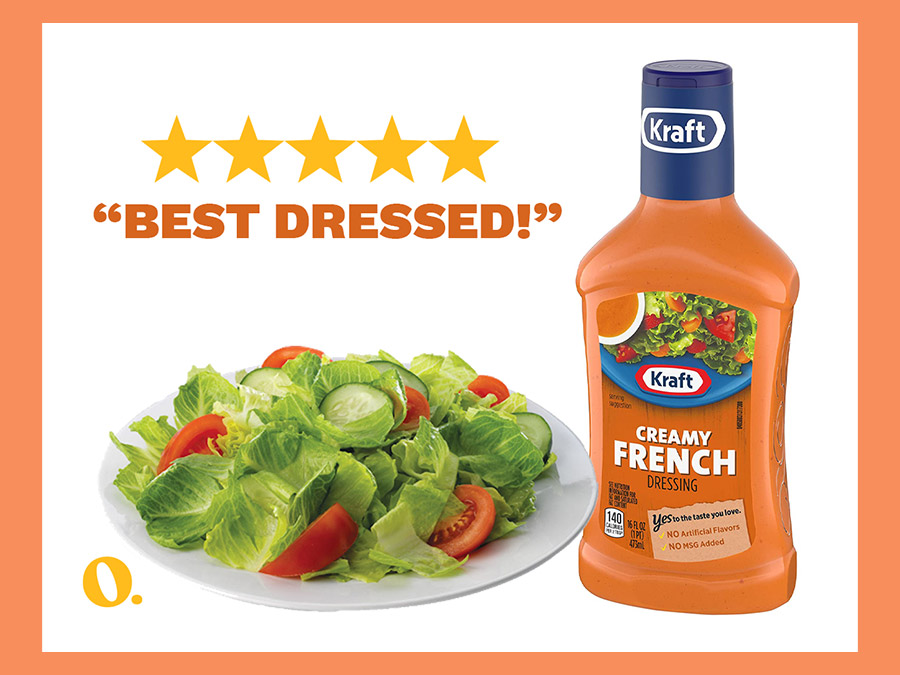
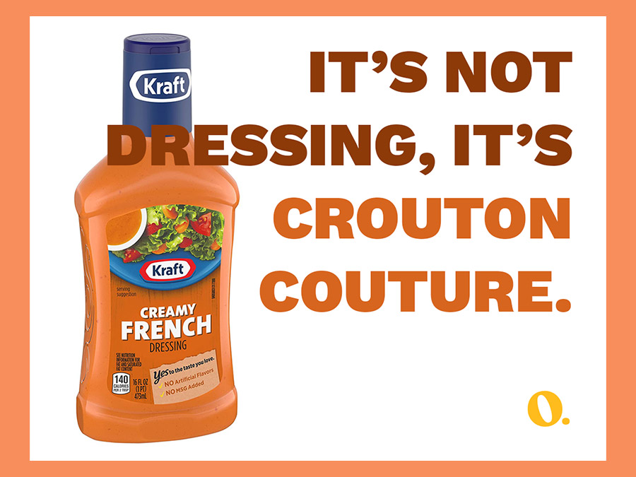
For this project, we dared to ask, What if French Dressing (ya know, the bright orangey-red staple found on Lazy Susans in mid-America in the 90s) was branded as truly French? So we rebranded this decidedly unfancy dressing as the height of sophistication; the height of good taste—as French as the name implies. Bon Appétit!
Tushy
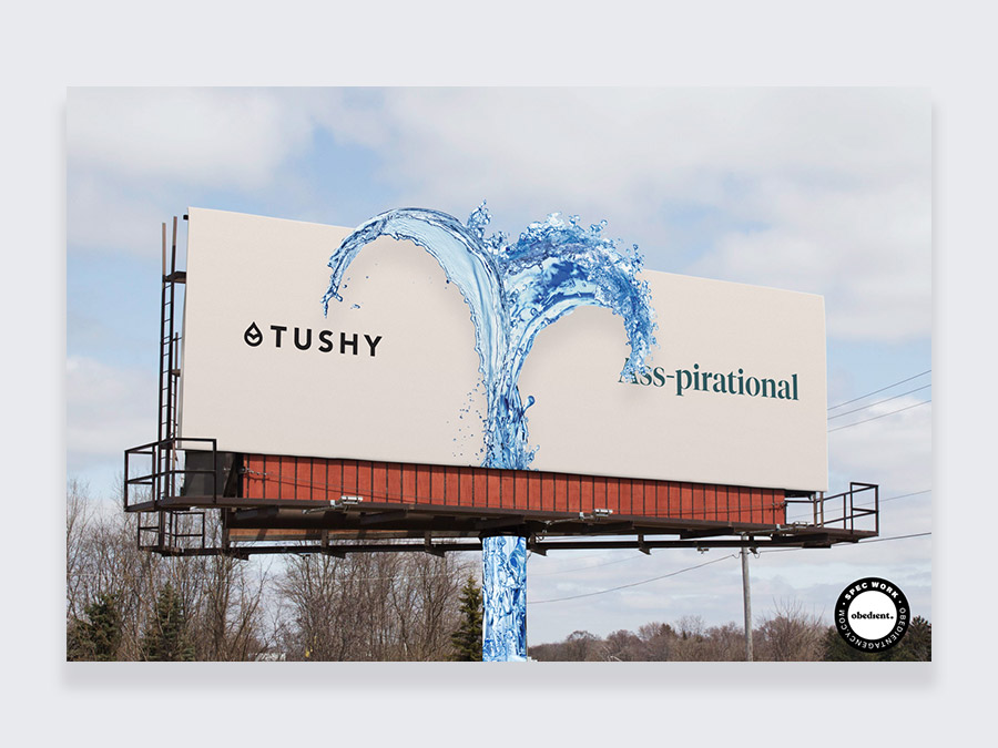
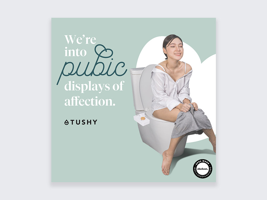
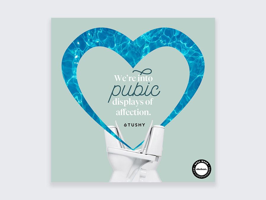
We’re flush with excitement about this one. Tushy, the modern bidet (and hygiene) brand, already had a great brand personality, but no one spices—and dials—things up like we do, so we set to work doing exactly that, Obedient-style.
Public Libraries
Check it out: some branding for an entity that you may think needs no introduction (err, epilogue?). But as a fun plot twist, we rewrote the branding story by casting humor as the main character, so that people would be delightfully reminded of this wonderful public resource.
Lowe’s
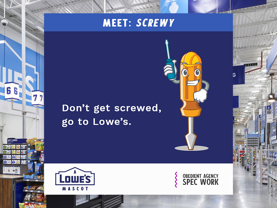
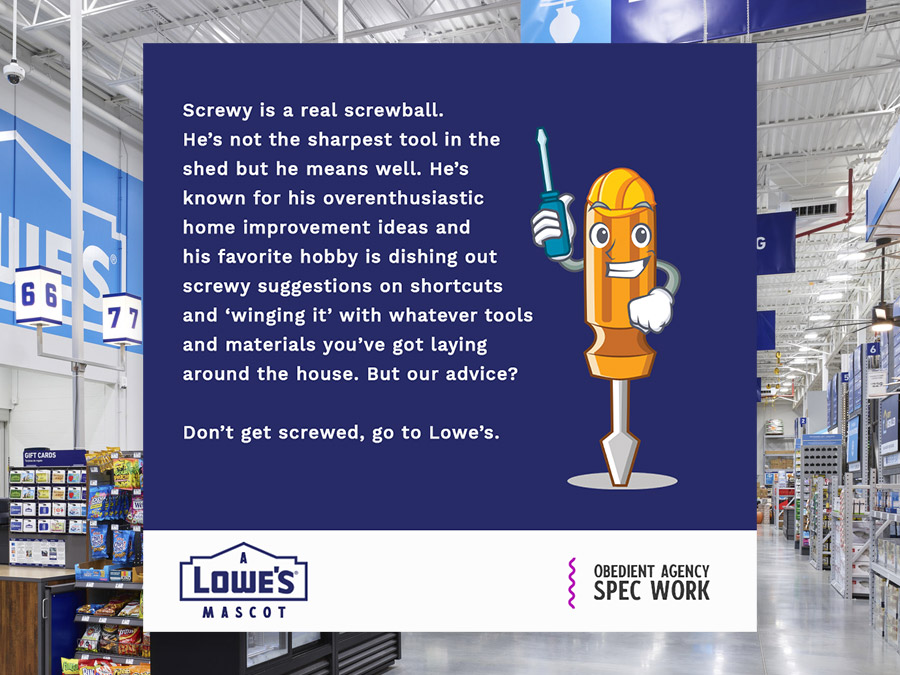
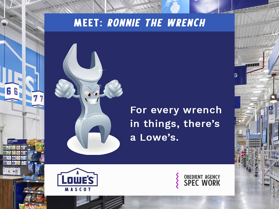
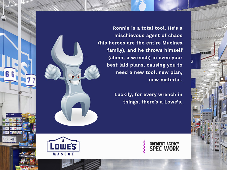
Just when you thought you knew the drill for our spec work projects, we go and throw a wrench in things. Here, we focused solely on hammering out a mascot—and their respective icons, taglines, and bios— that would have the potential to be marketing mouthpieces for the brand. Dare we say we nailed it? Boo, hiss.

