Blue Bunny
Our coolest project yet: developing a big personality for a (tiny) new ice cream innovation that hit mass appeal with both kids and adults. (Not an easy feat even for a delicious treat.)
Services
Product Innovation Naming, Flavor SKU Naming, Packaging Copy, Campaign Conceptualization

The Backstory
When the Senior Innovation Manager for the parent company to some of the most iconic frozen treat brands (Halo Top, Blue Bunny, Bomb Pop) gets in touch about new product innovation that needs to launch with a double scoop of fun…you scream. And because they know that screaming for ice cream is sort of expected, they wait for you to finish and then hire you to name the new product, all 7 of its corresponding flavors, and the creative direction + copy for each SKU’s unique packaging design. The challenge? Crafting a campaign that was entertaining to kiddos and adults. But, of course, the cherry on top of working with Obedient is our strategic, ingenious approach ensures that when it comes to a successful, resonant launch, the brands we work with always get their just desserts.
Product Innovation Naming
Naming is one of our very favorite projects to work on, but it’s also one that’s often the trickiest—especially when you’re working on a launch of this magnitude (cue the red tape!) Among the creative parameters we helped define, our name for Blue Bunny’s new platform had to include the word ‘Mini’ (to properly indicate its miniature size and to continue to build on an existing, ‘sister innovation’ within the brand), but it couldn’t be confused with competitors who just slap ‘Mini’ onto their existing brand name. It also needed to allude to a distinct, ownable structural element of the platform beyond simply being a “bar.” A few more just to remind you how good we are at our jobs: the name needed to make sure the size references avoided ‘dieting’ perceptions and instead encapsulated the Blue Bunny ethos of ‘permissible indulgence.’ And of course, the cherry on top: it had to delightfully appeal to both children and adults. We landed on a name that miraculously did all of that, and also was ripe for a fun narrative throughline. What a treat!
Product Naming
Our approach to naming the specific products within the platform (for the layman, each flavor of the Mini Dunks), we presented an array of creative devices—essentially structural and/or tonal theme that unifies the flavor names so that they are creatively cohesive. The benefit here was that the client got to see a few naming examples within each device in order to determine what is best for the platform. From “Fancifully Straightforward” (a slightly heightened traditional format) to “Playful Puns” (a more fresh, playful take a la Ben & Jerry’s), Blue Bunny got a taste (wink) of what the catalog of flavors would look like. From there they actually chose one device to guide the flavor naming, and their second favorite device to guide the package copy. Win/win!
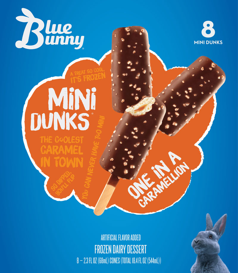
One In A Caramellion
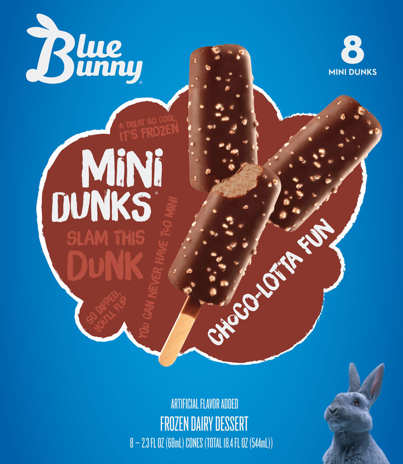
Choco-Lotta Fun
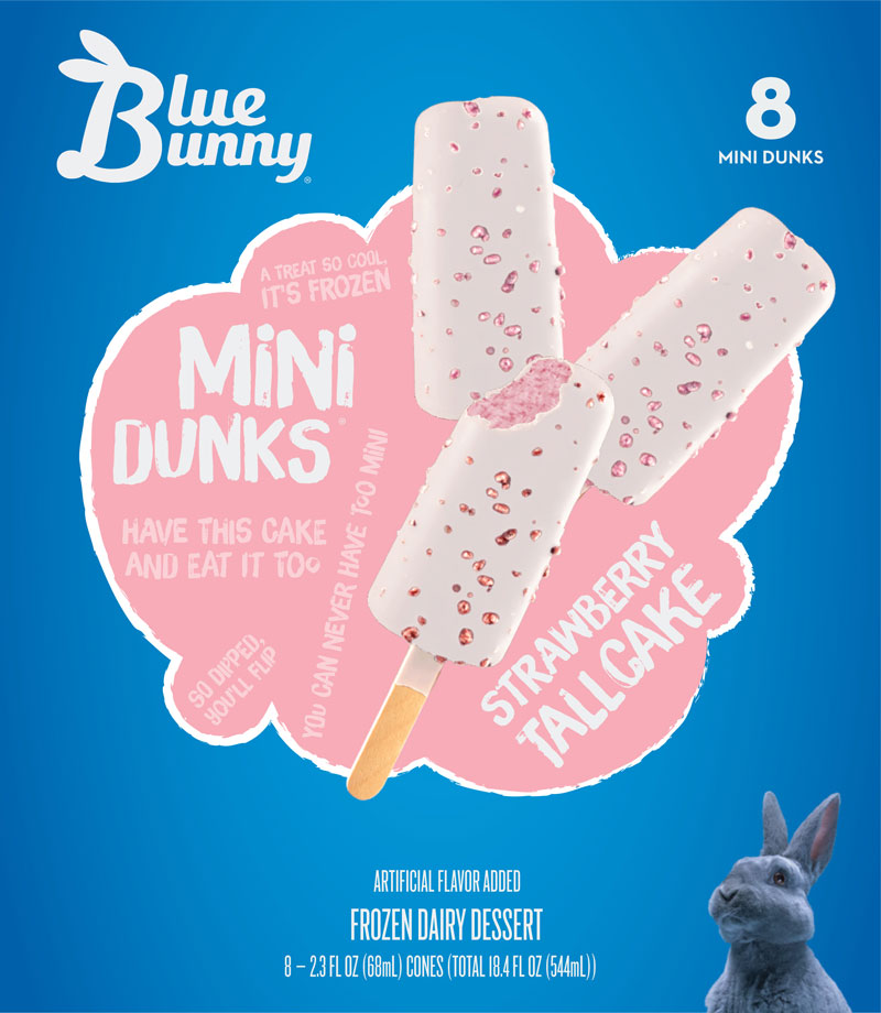
Strawberry Tallcake
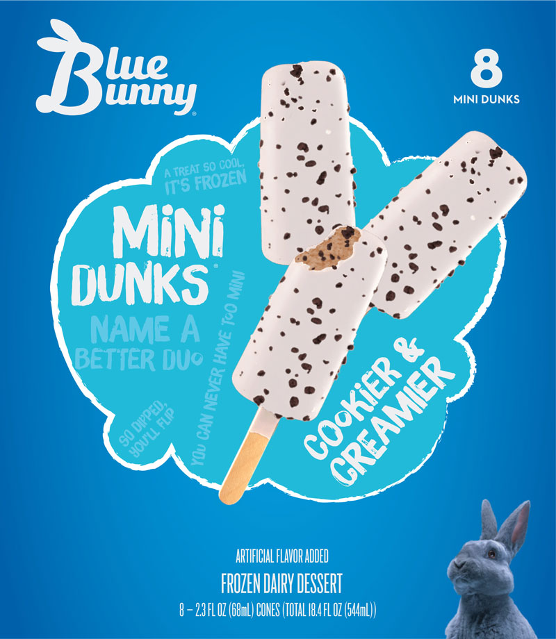
Cookier & Creamier
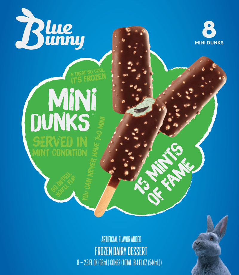
15 Mints of Fame
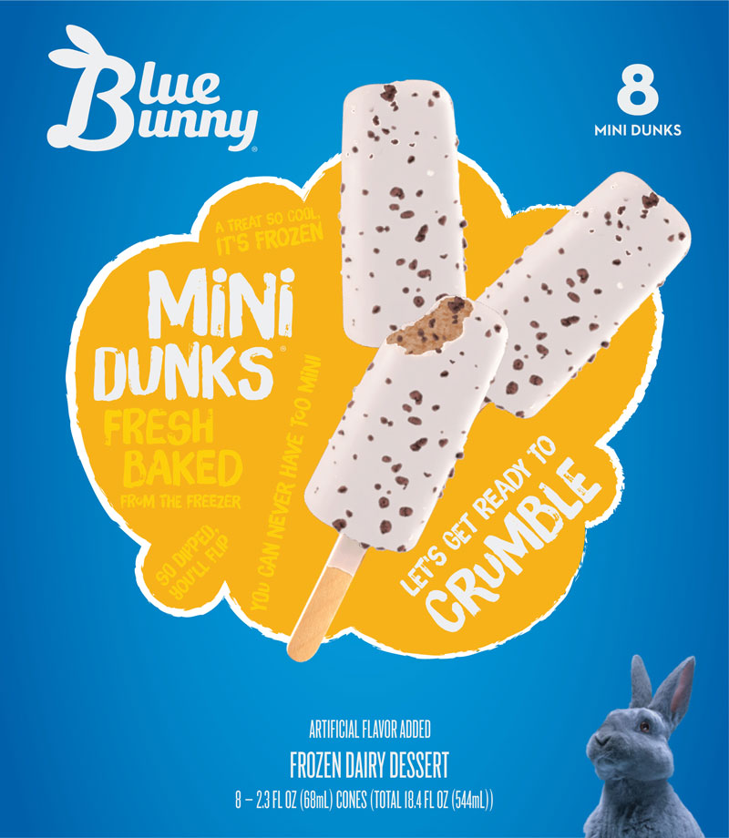
Let’s Get Ready To Crumble
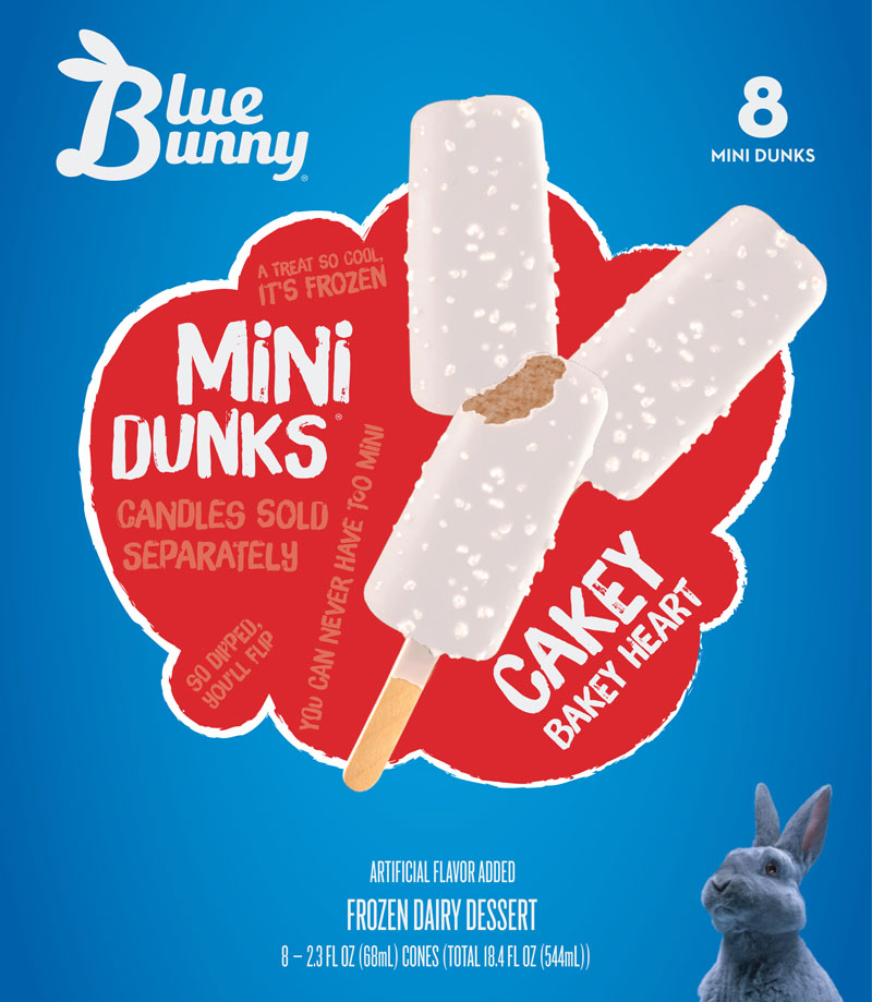
Cakey Bakey Heart
Packaging Copy
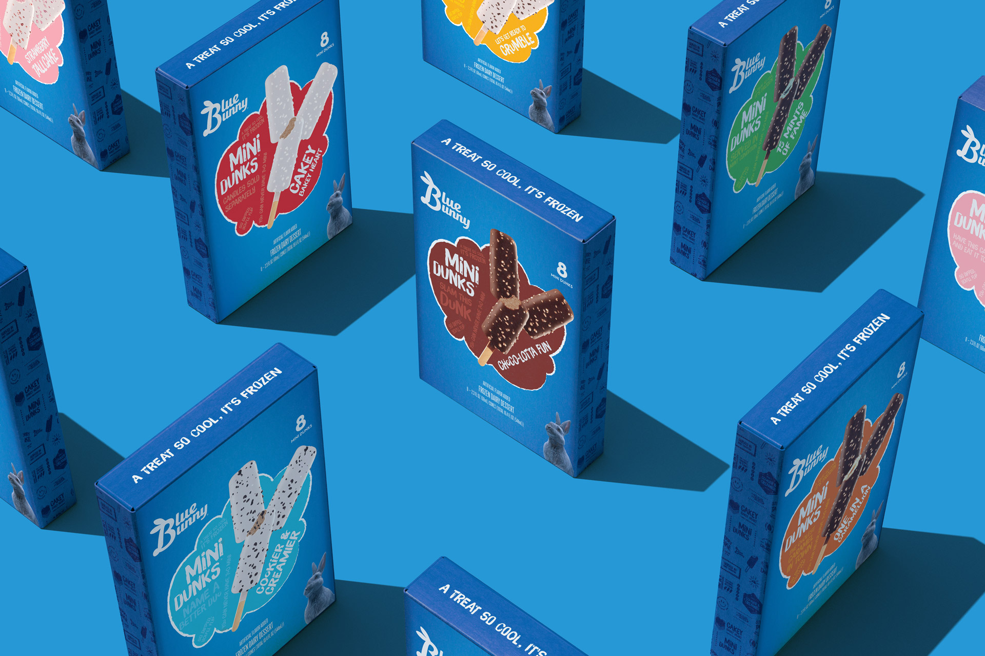
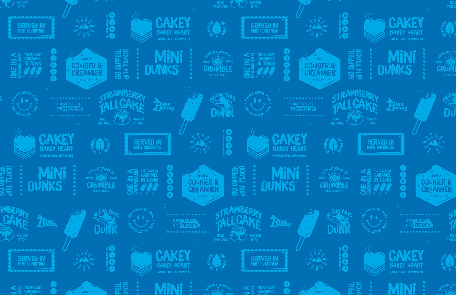
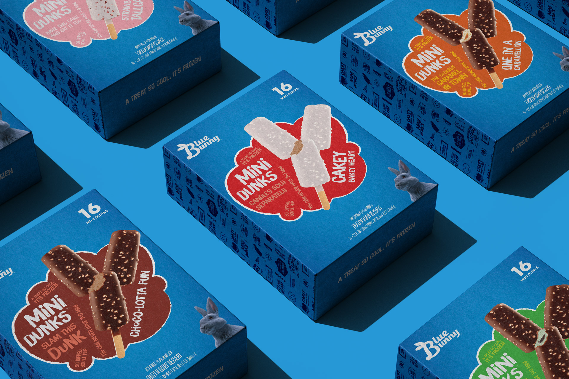
Here we were tasked with creating the entire suite of packaging copy for Mini Dunks. Blue Bunny refers to this branded copy as ‘quips’—which we love because ‘witty remark’ is obviously right up our alley. We created a number of universal quips to be featured across the platform as well as flavor-specific quips that correlated with each SKU. Because we believe truly clever copy never sacrifices clarity, we anchored the quips around a benefit or feature of the specific flavor or broader platform, and where applicable, highlighted a more nuanced element of the flavor. We ensured that there was a structural variation among the universal quips and flavor-specific quips so that nothing felt redundantly phrased and we kept in mind the quips on the ‘sister innovation’ so there would be consistency between the two platforms, but not overlap. And lastly, true to the entire project’s aim, we tailored the quips to adults and kids alike—making sure they were fun to read, fun to say, and fun for the whole fam.


